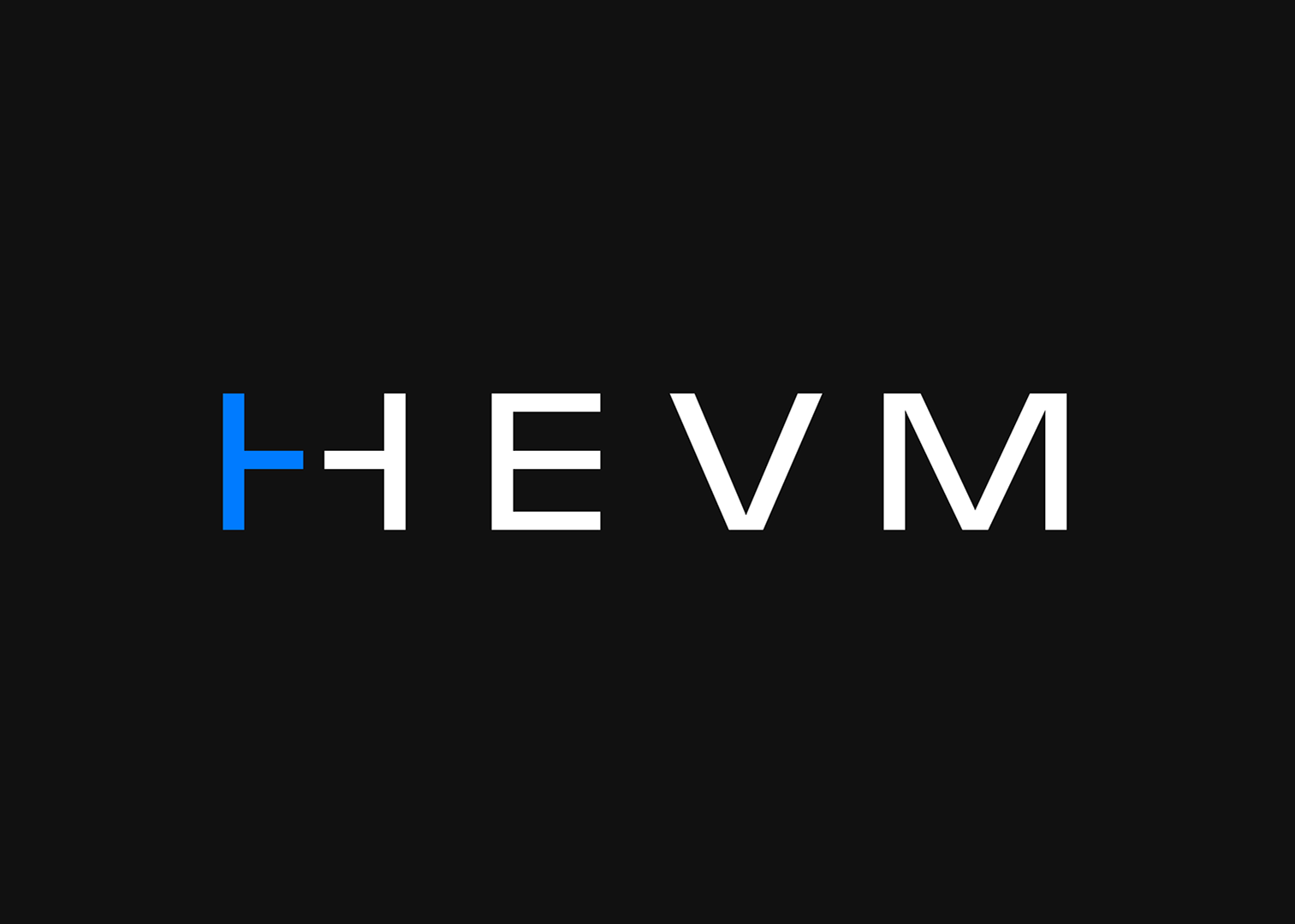
As critical infrastructure serving over 650,000 validators (including many solo stakers), Aestus needed an identity that would communicate trustworthiness and neutrality, which is exactly what Octant's Design for Ethereum competition challenged me to deliver.
The name Aestus comes from the Latin root for estuary, a place where fresh river water mixes with saline ocean water, creating a healthy environment for life to thrive. This concept of flow, mixing, and neutral infrastructure was my inspiration for designing their visual identity.
Logo Concept
The logo uses wave forms integrated directly into the letterforms, visualizing the concept of an estuary where different waters meet. The three horizontal waves replacing the E's middle strokes represent the flow of information between validators, the relay, and block builders, three distinct entities coming together in a neutral space.
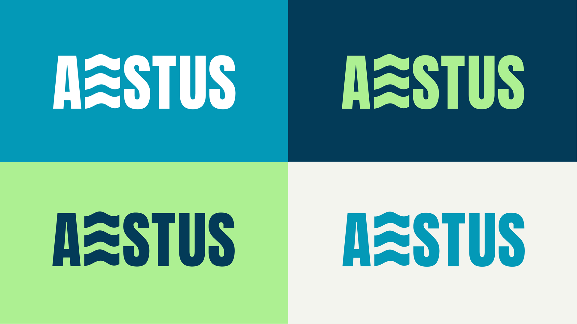
I kept the typography bold and geometric to convey the technical infrastructure side of what Aestus does, while the waves add movement and approachability. The design needed to work across technical documentation, GitHub repositories, and validator dashboards, so clarity at small sizes was essential. The wave motif is simple enough to remain legible even when the logo is shrunk down to a favicon or profile icon.
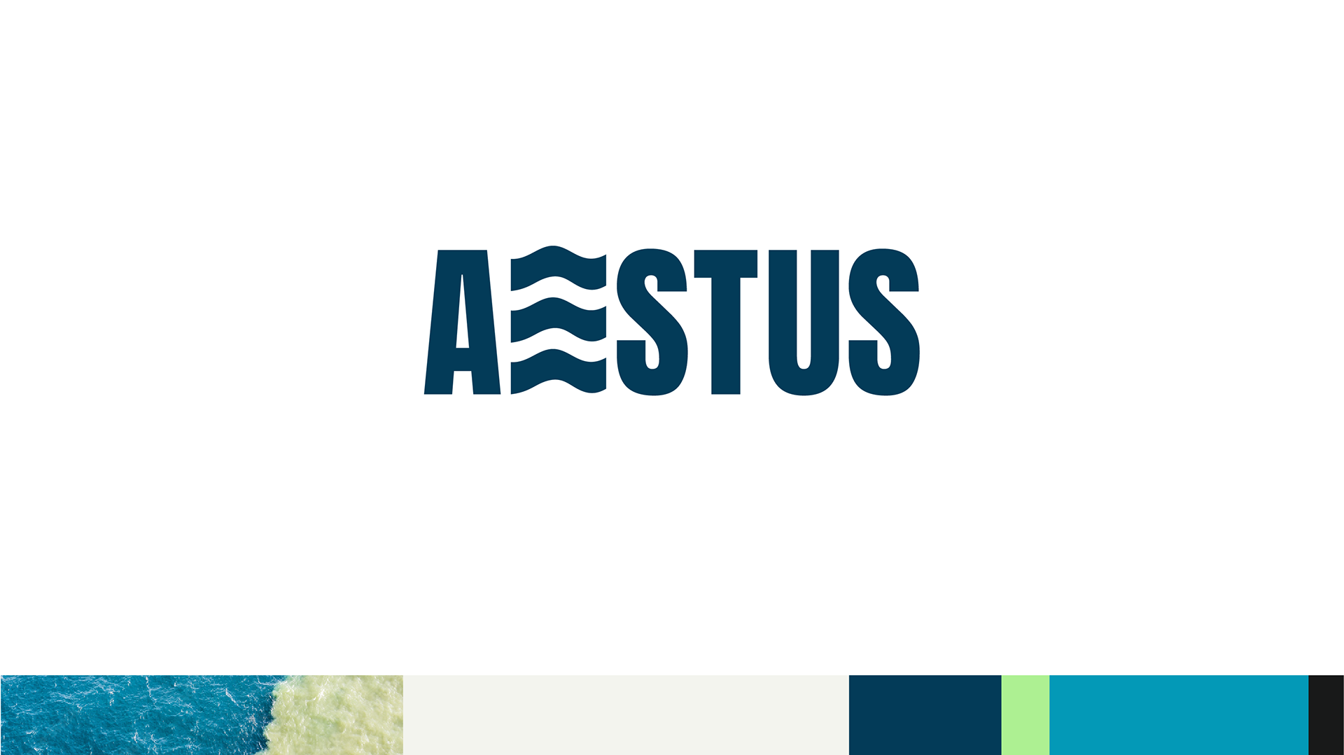
Color Palette
The color system draws directly from ocean depths, moving from deep navy through turquoise to light mint green. This represents the mixing of waters in an estuary, transitioning from deep ocean (dark blues) to shallow coastal areas (bright greens and teals). Deep Navy serves as the primary brand color, conveying trust and stability appropriate for infrastructure handling millions in validator rewards. Bright Teal and Mint Green provide contrast and energy, representing the flow and movement central to the relay's function.
The palette avoids the typical blockchain purple/neon aesthetic, instead opting for something more organic and trustworthy. Ocean colors feel neutral, calming, and universal, which is exactly what you want from infrastructure that needs to be perceived as unbiased and credible.
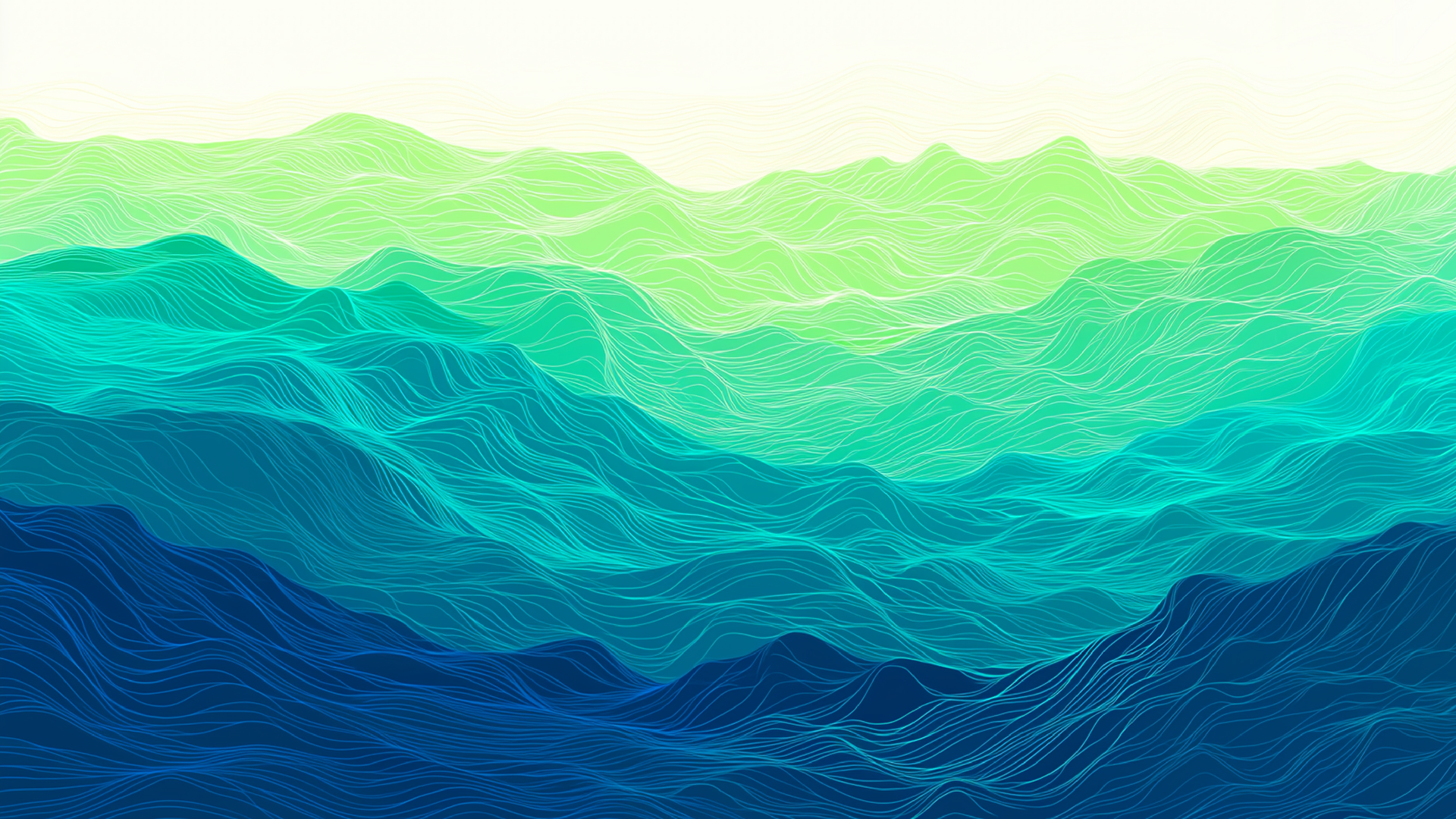
Visual System
The wave pattern extends beyond the logo into a full visual system. I created layered wave graphics with Midjourney that can be used as backgrounds, headers, or decorative elements across documentation and web interfaces. The waves flow horizontally (like the relay's function of passing information), and the gradient color application reinforces the estuary concept of multiple colors mixing together naturally.
This modular system gives Aestus flexibility across different contexts while maintaining strong brand recognition. Whether it's technical documentation, social media graphics, or conference materials, the wave motif ties everything together.
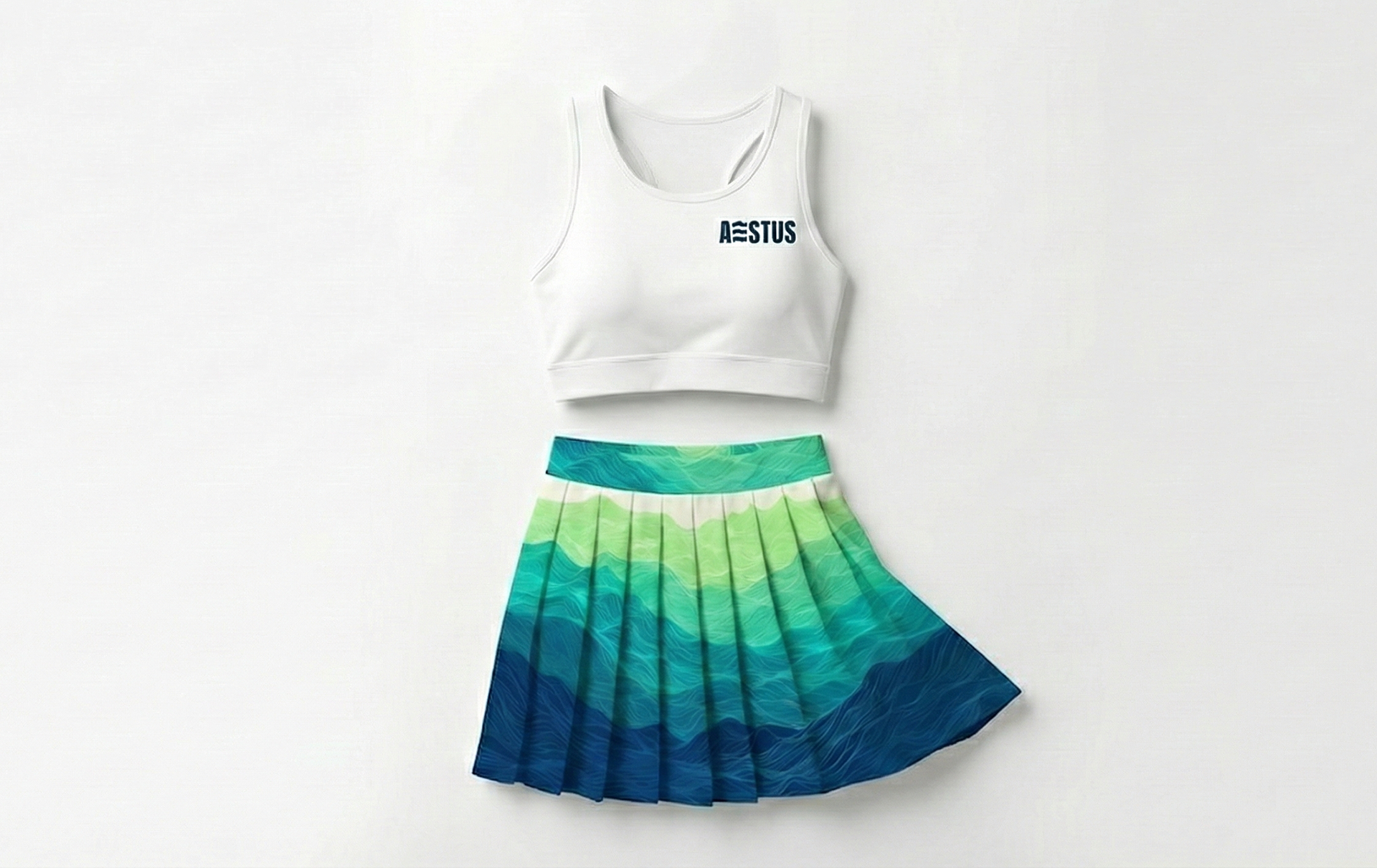
Apparel and Merch
The wave pattern translates beautifully to apparel and merchandise, creating movement even when standing still. I chose activewear specifically to mirror the brand's ethos of movement. The wave pattern lends itself naturally on athletic pieces, turning the brand's technical infrastructure roots into something unexpectedly wearable.
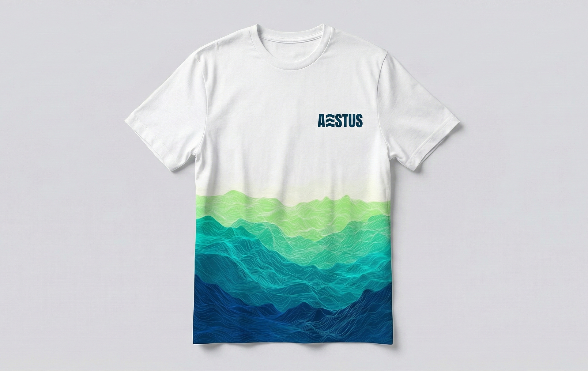
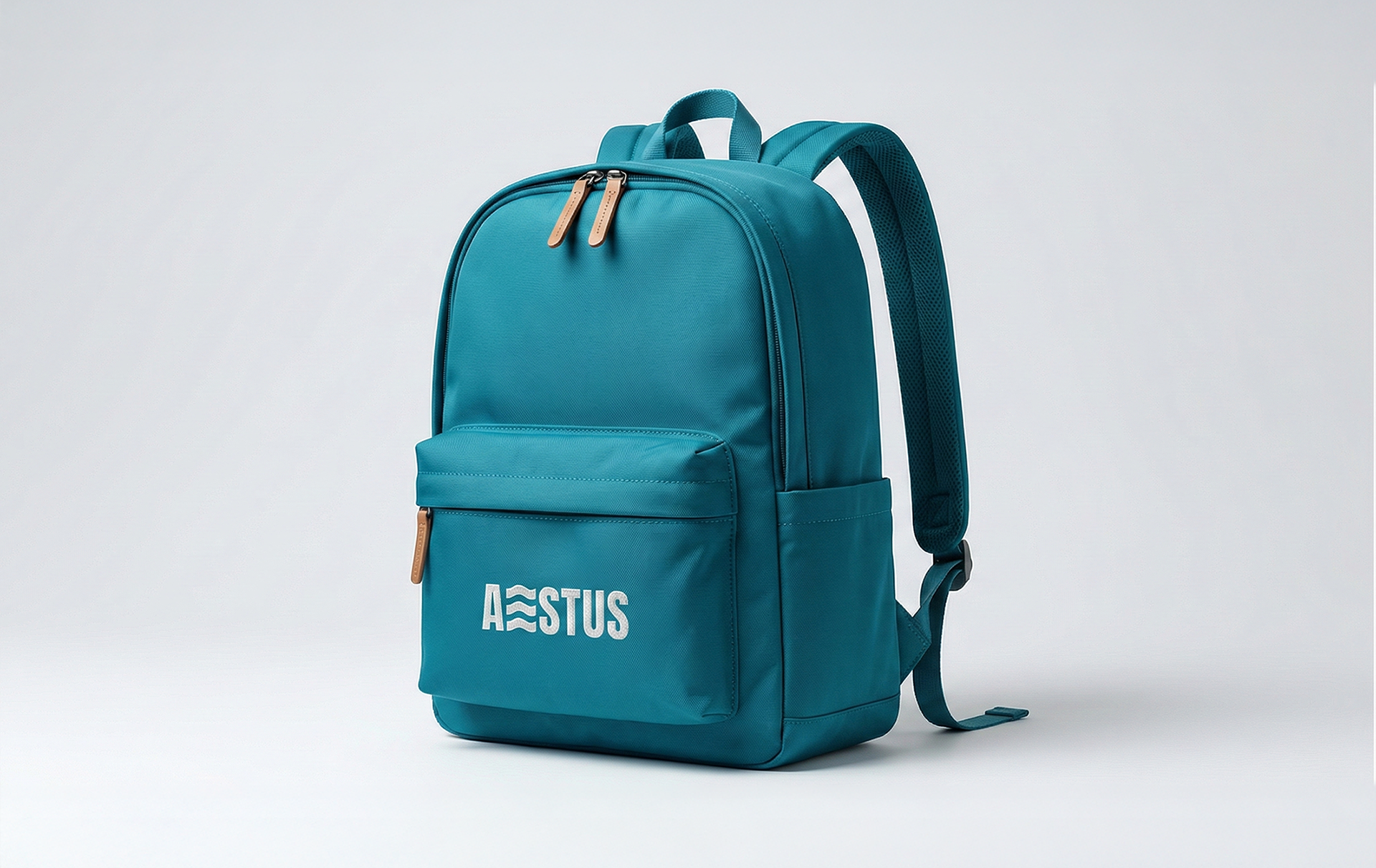
The pattern and colors translate beautifully across pieces, reinforcing the brand's concept of movement and flow.