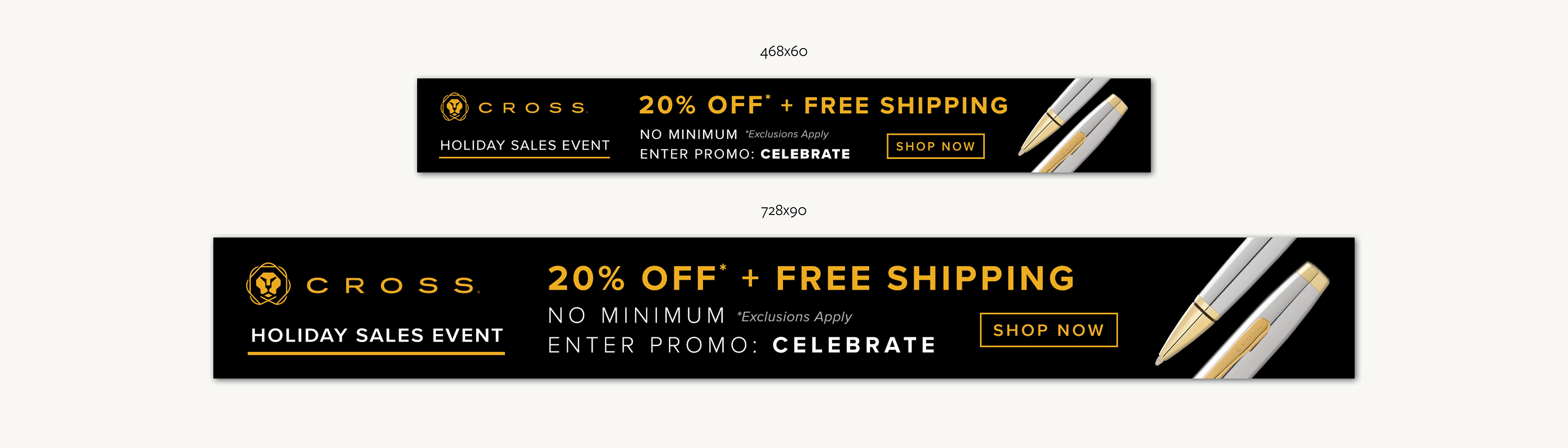
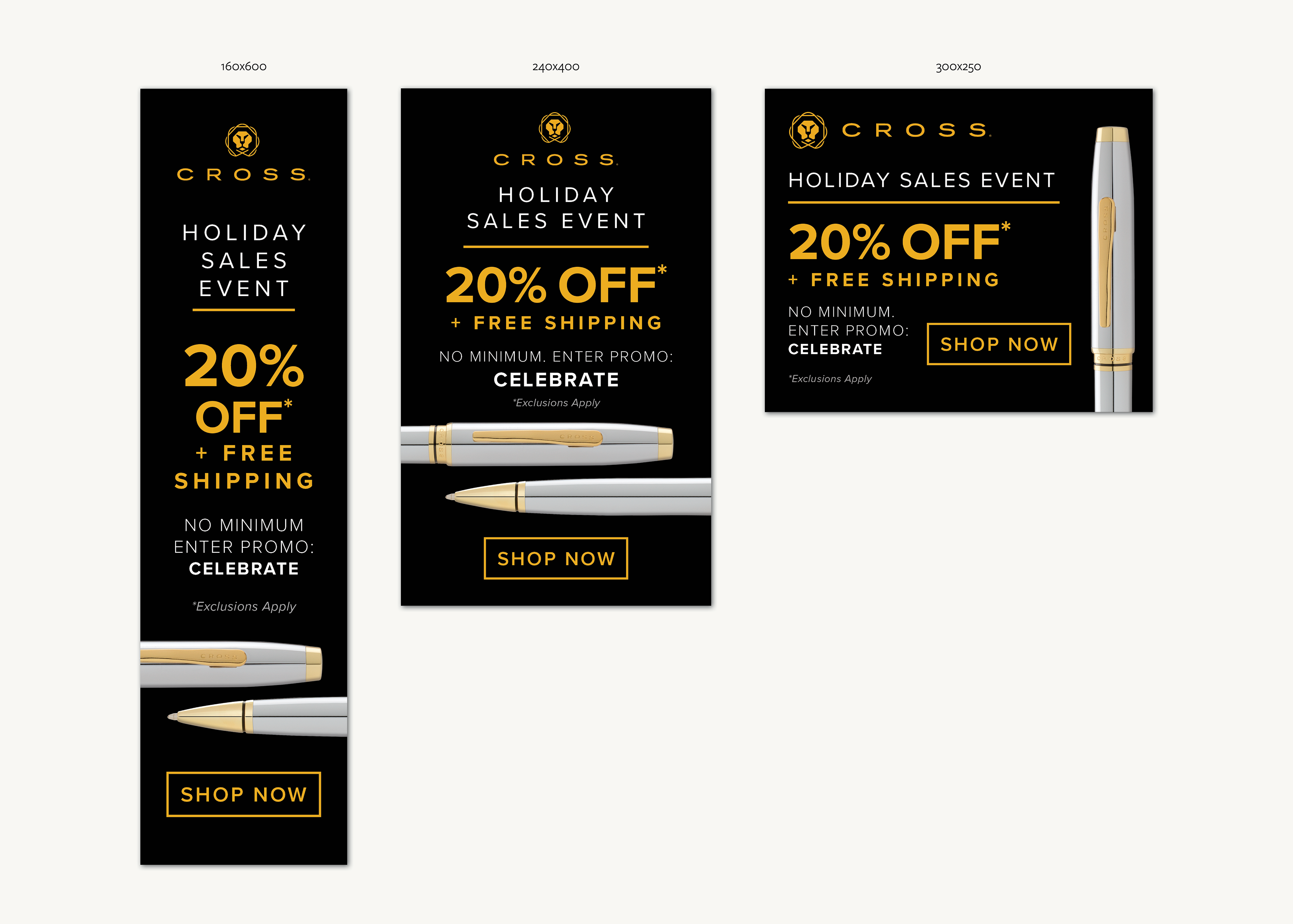
I loved creating these web banners for A.T. Cross not only because they create outstanding writing instruments, but also because I got to play around with their updated brand look and feel right after their shiny new rebrand. Win-win!
I've found that designing for small sizes requires a level of finesse and a dogged focus on only the essentials. Can we make the copy shorter? How can we fit a button? Do we need a button? It's a simple enough execution of one look and feel across a few different sizes, but I love that it's a creative challenge.