The Traveling Mat Brand Identity
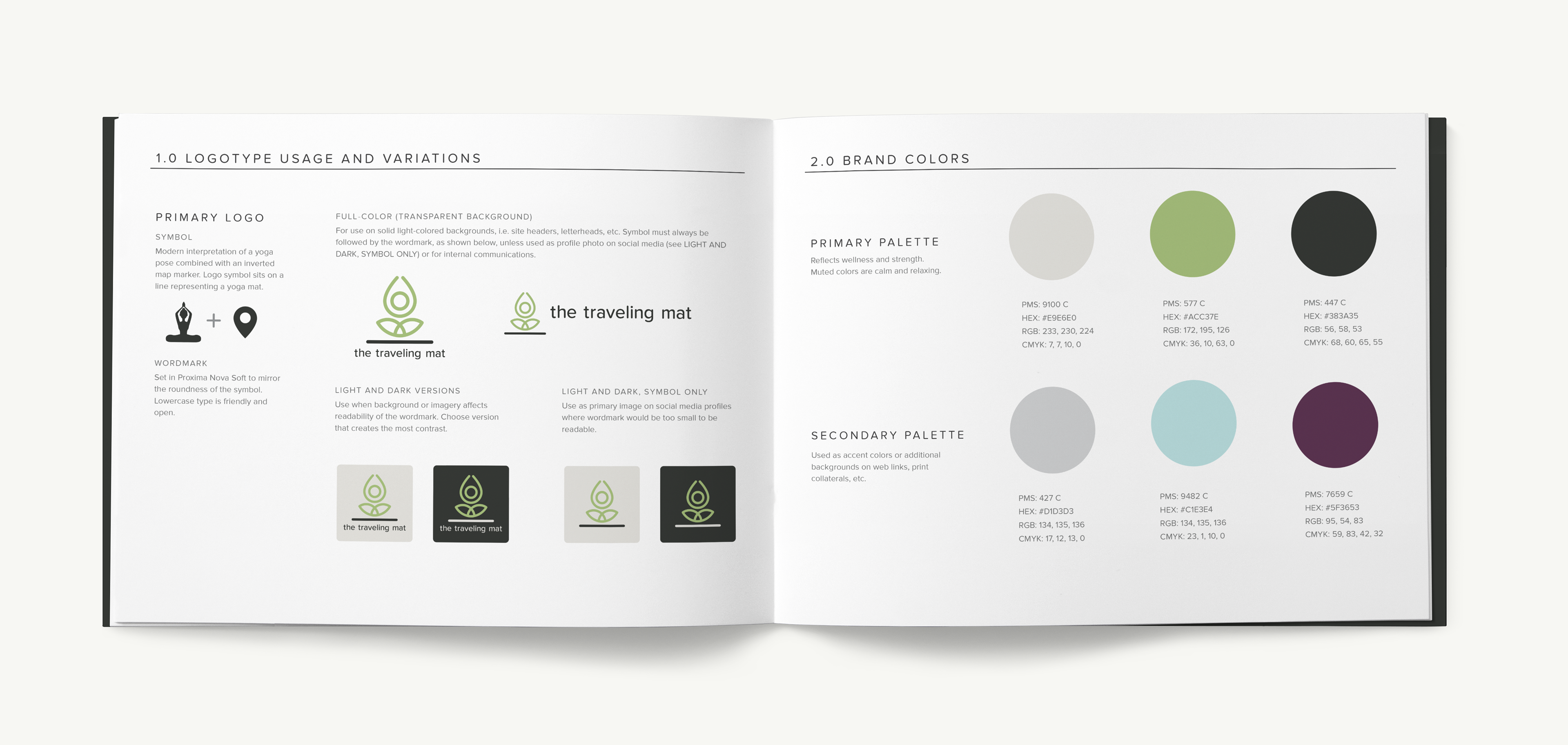
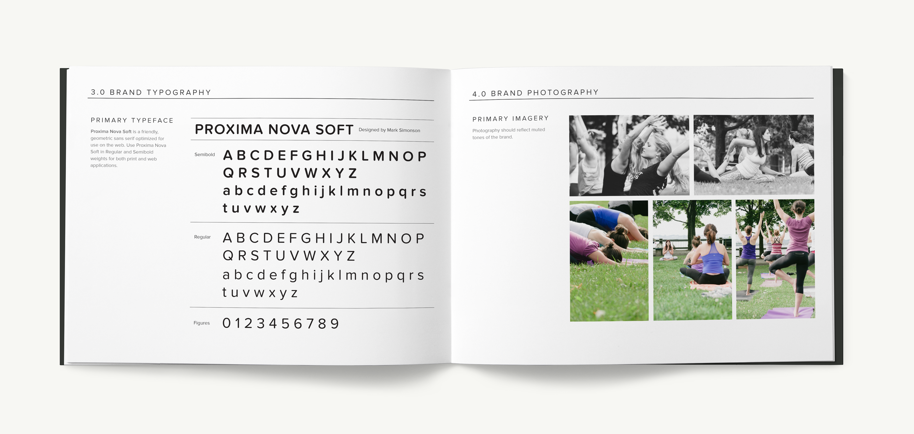
I designed the identity and brand guidelines for The Traveling Mat around the idea of wellness and strength. I wanted their clients to feel that they can destress, recharge, and train with The Traveling Mat because The Traveling Mat meets their students where they are, wherever they may be on their fitness journey. The color palette and typography reflect this while at the same time communicating a sense of friendliness with rounded shapes and letterforms.
The logo is a modern interpretation of Sukhasana (Easy Pose) combined with an inverted location marker. The symbol rests on a line that represents a yoga mat and the logo as a whole represents The Traveling Mat's business of being a mobile fitness studio.