I've been an active member of Stewart Alsop III's AI Whisperers and gladly welcomed the opportunity to work with him on the visual identity for his YouTube podcast, Stewart Squared. Together, Stewart and his dad, Silicon Valley veteran Stewart Alsop II, decode tech's history to illuminate its future, offering a unique dual perspective.
I wanted to visually communicate that evolution while honoring the show's generational conversation. Using Midjourney, I generated custom illustrations representing key technological eras, then built the brand system around them. That horizontal line threading through each composition became more than just a design element. It's the visual timeline connecting past to future, father to son, quite literally tying the brand together.
What I loved most about this project was the freedom to lean into storytelling through AI-assisted design. The timeline isn't just decorative; it reinforces the podcast's mission to explore how we got here and where we're headed.
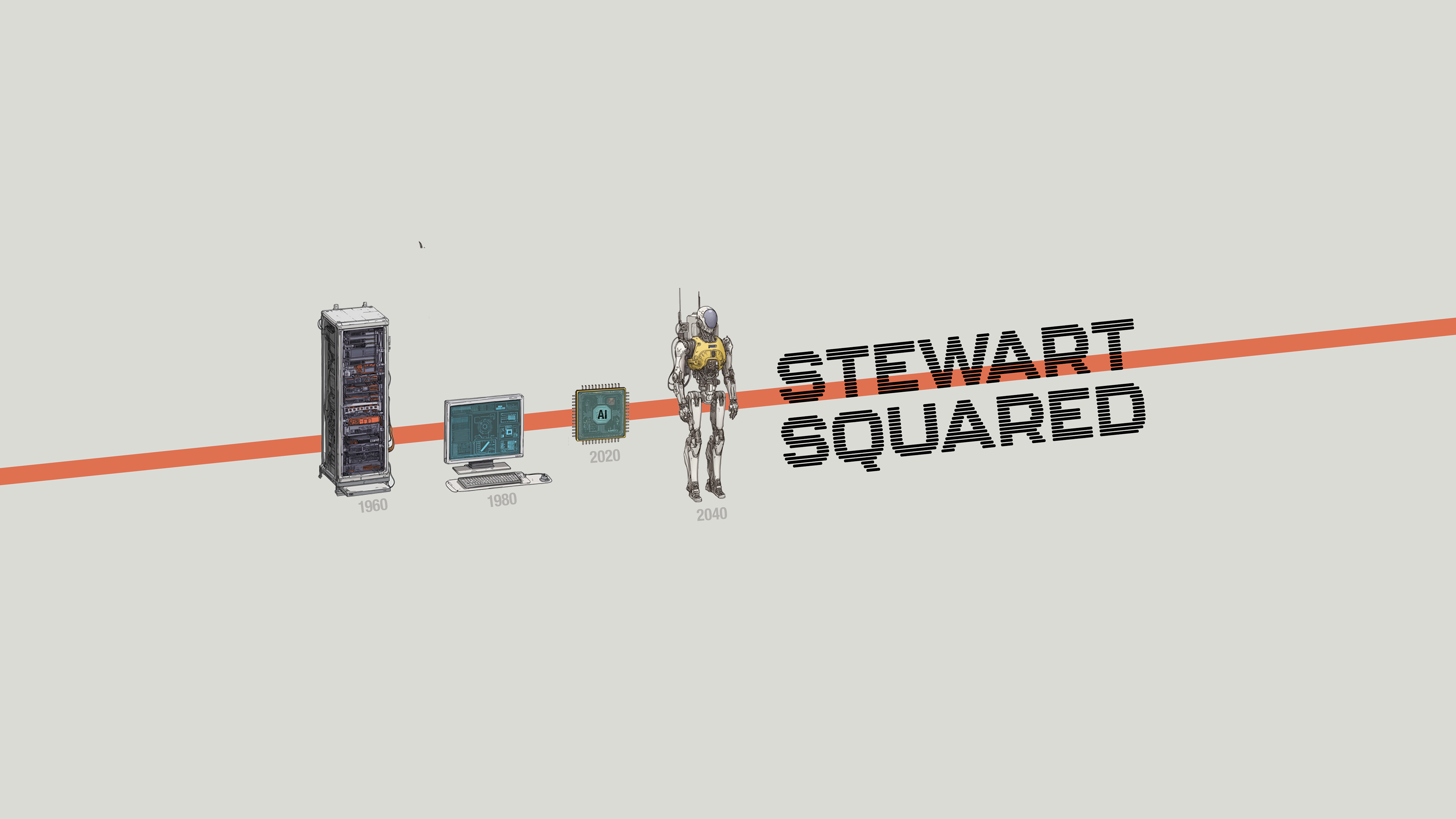
Timeline graphic easily extends to accommodate larger screen sizes (shown here sized for TV).
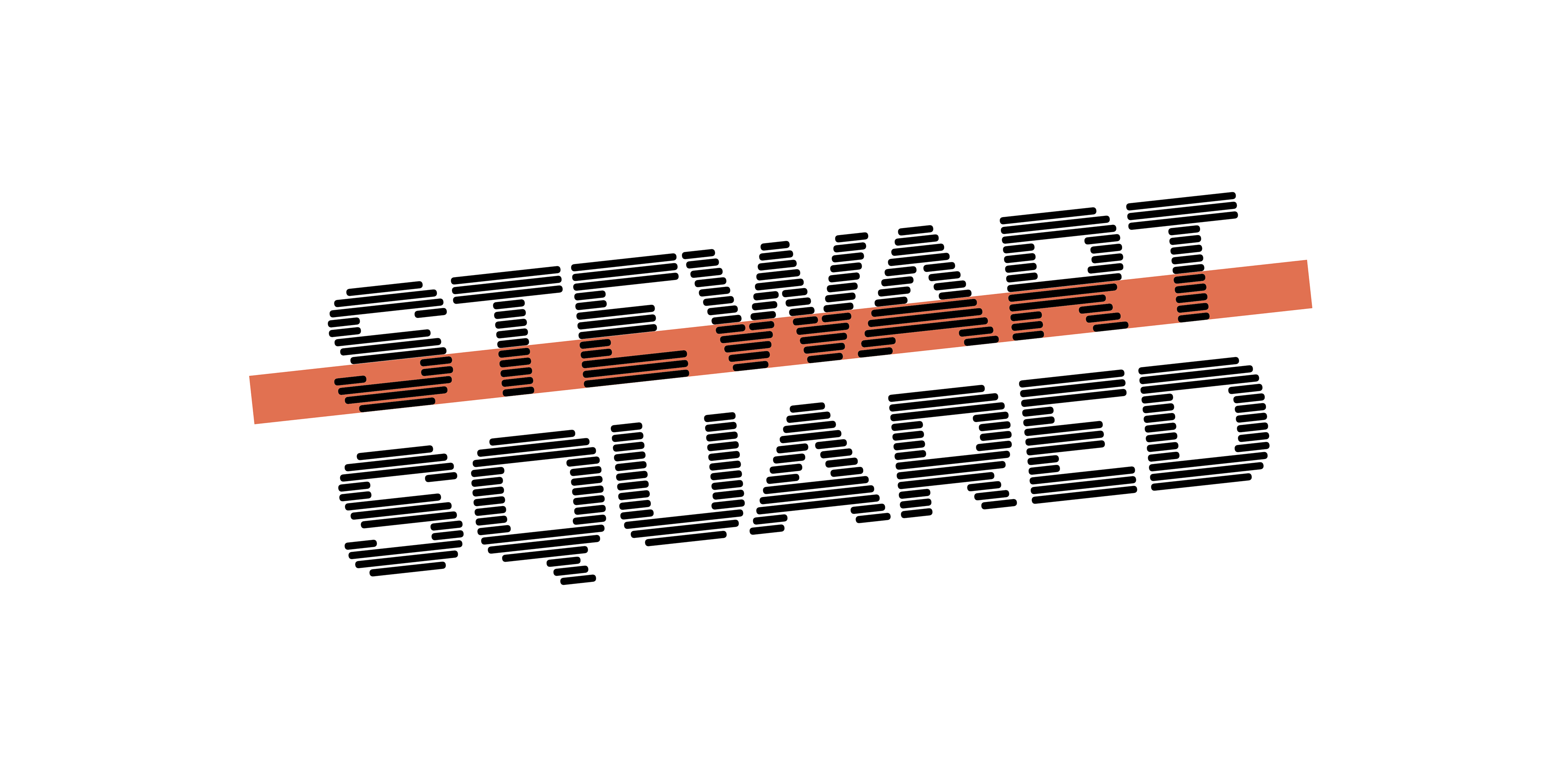
Logo Concept
I designed the Stewart Squared wordmark uses a stacked, striped typeface that visualizes the layering of generational knowledge, while adding texture and dimension. The graphic line slicing through the middle anchors the design and reinforces the brand's timeline concept, resulting in a logo that feels technical yet approachable and with enough character to stand out.
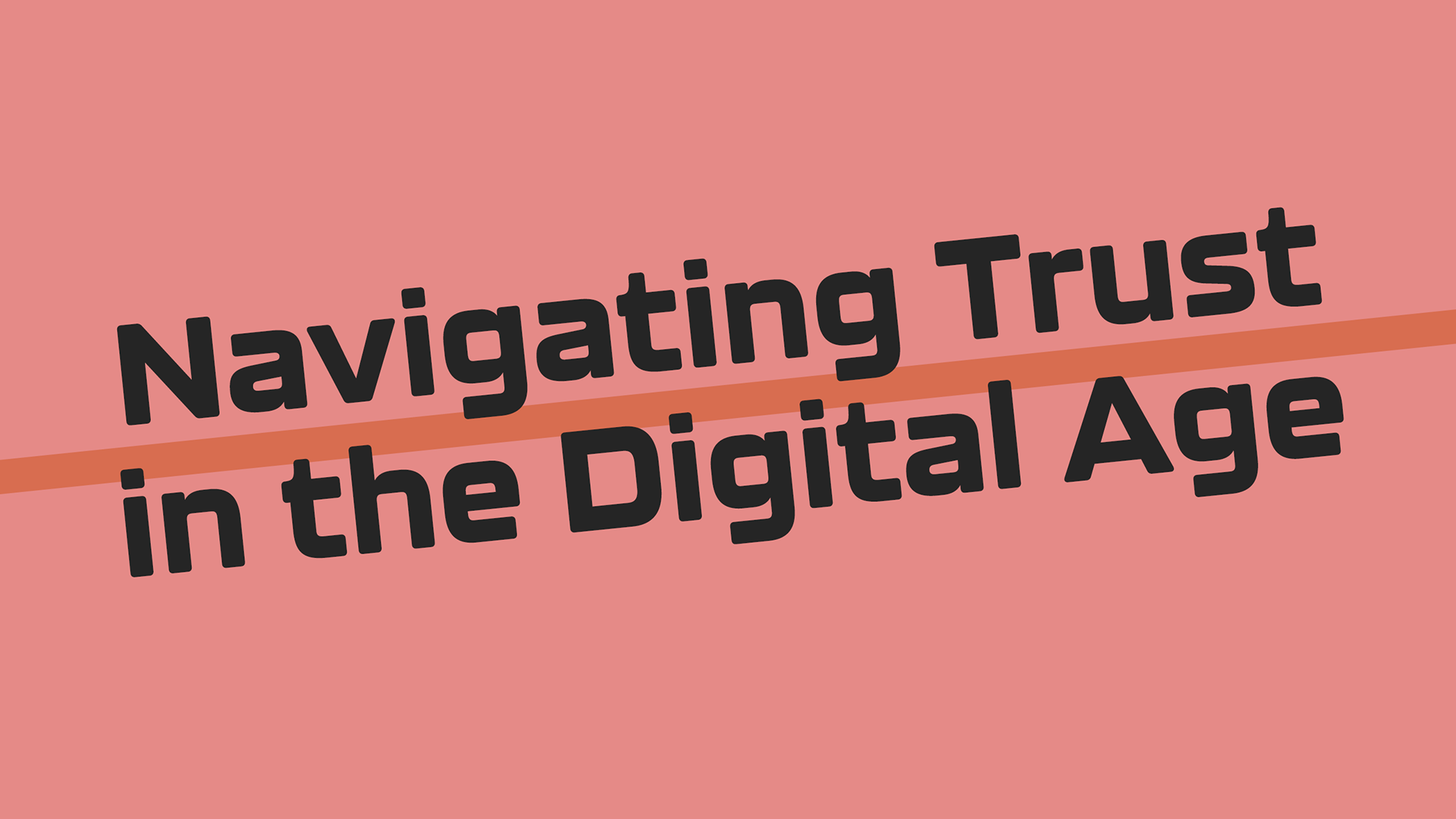
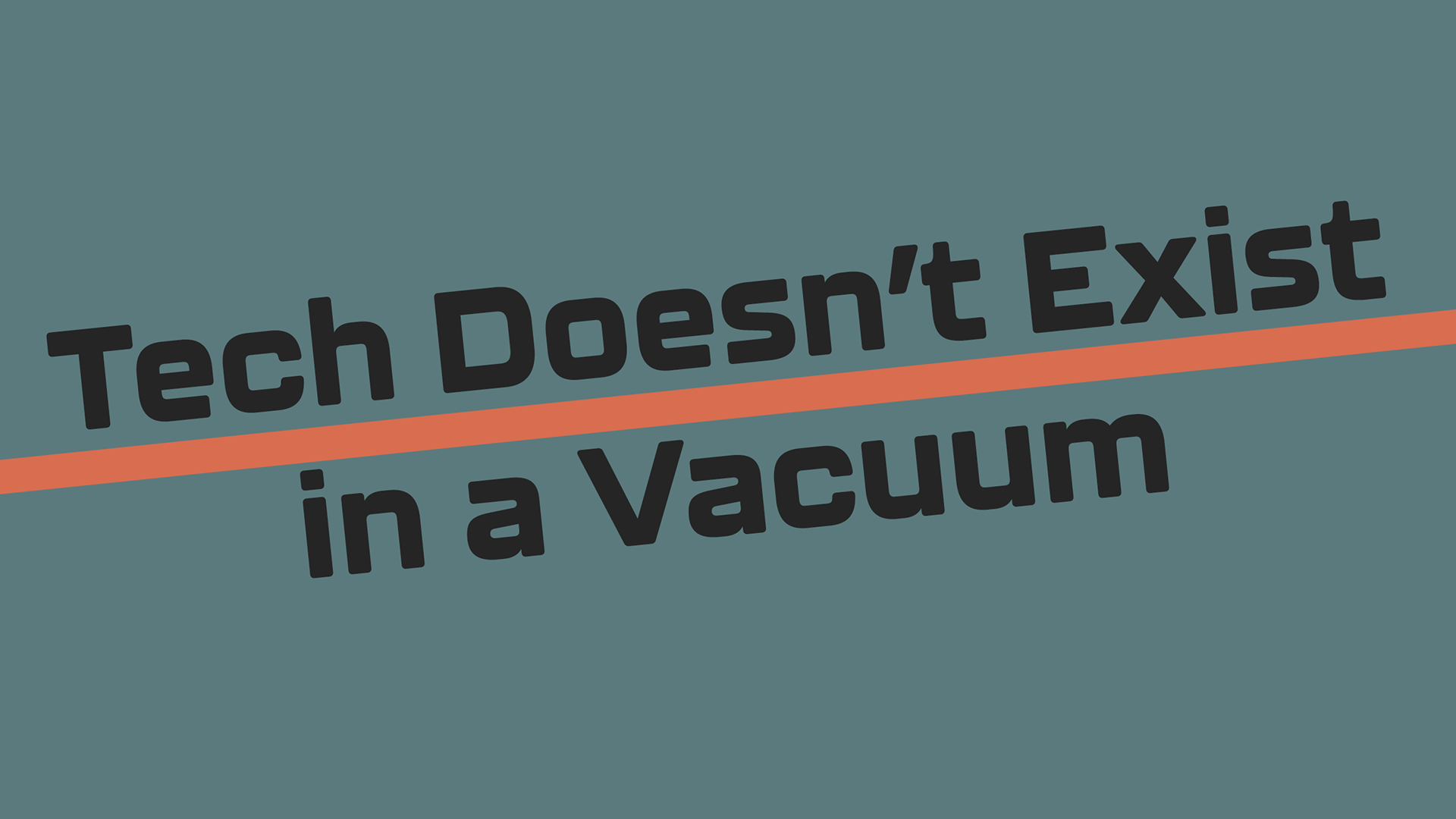
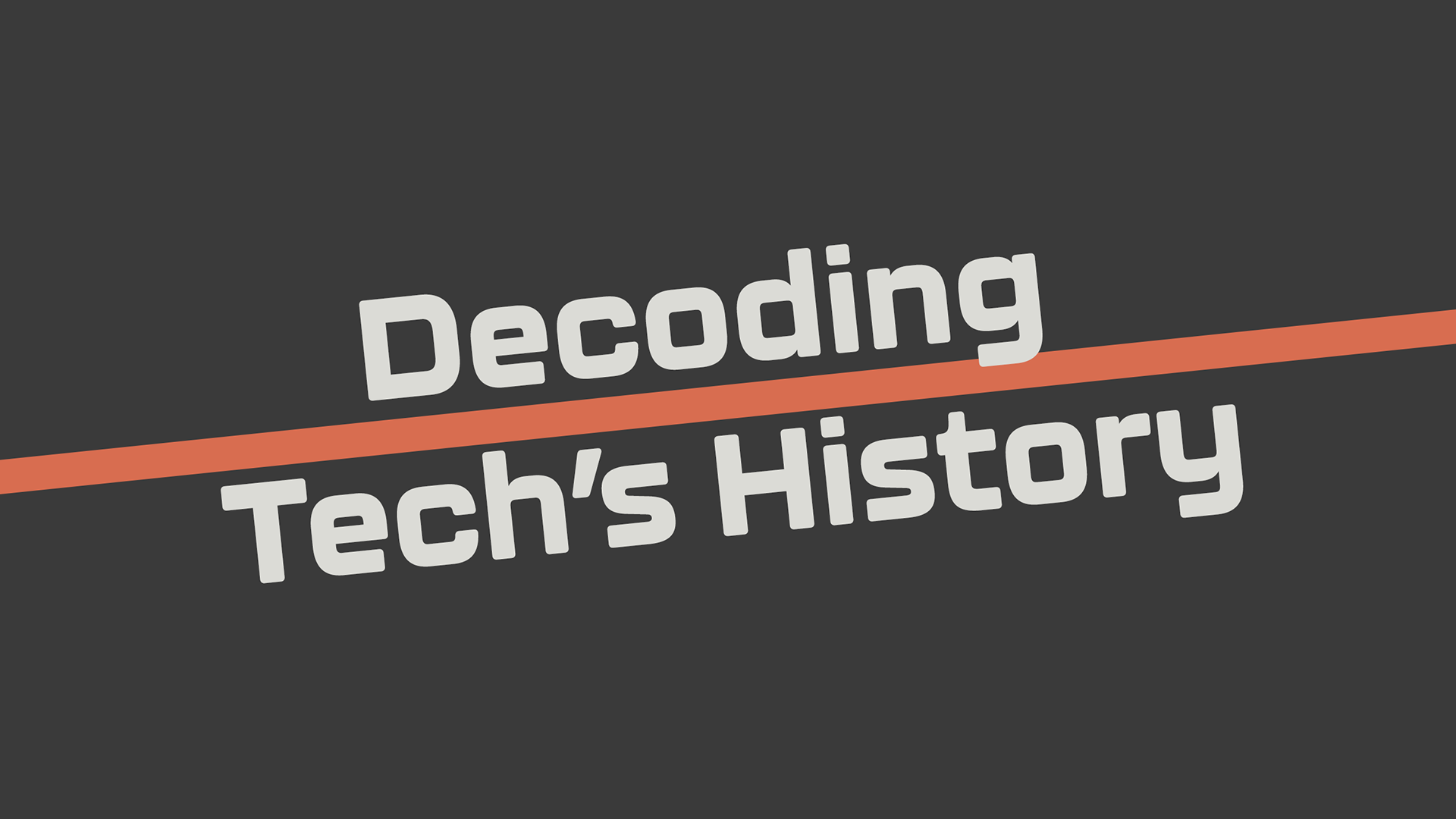
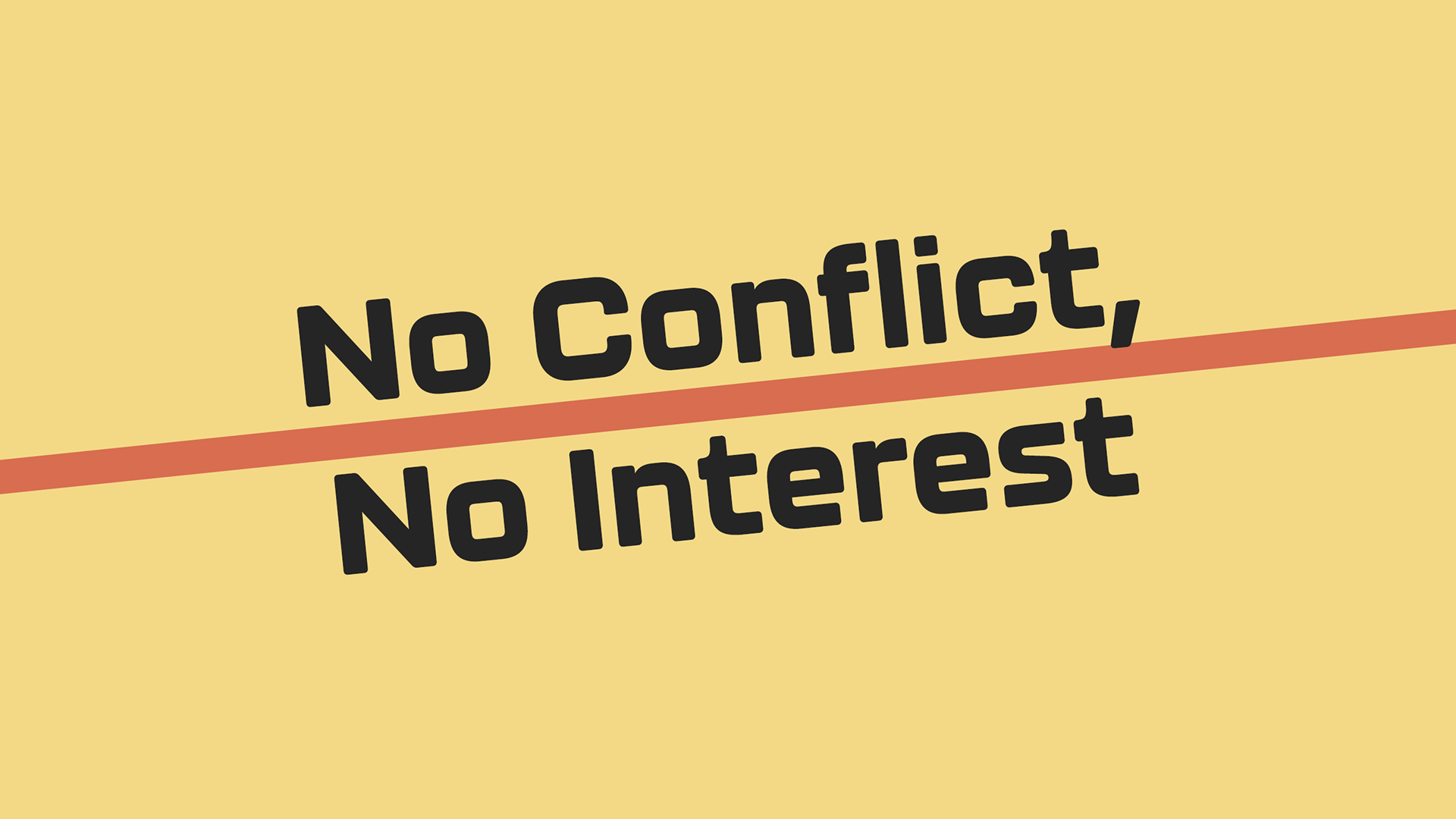
YouTube Thumbnail mockups showcasing the brand assets in use.
Color Palette
The color scheme strikes a balance between nostalgic tech aesthetics and modern sophistication, reflecting the show's spanning of computing eras. I drew inspiration from mid-century computing: those warm corals, muted slate blues, dusty teals, and earthy tones that feel both vintage and timeless. This felt particularly appropriate given Stewart II's early Silicon Valley days and Stewart III's AI-driven present.
I didn't want to use the saturated neons you'd expect from typical tech branding. Instead, I chose colors that are sophisticated and understated, allowing the concept and typography to take center stage while still feeling warm and inviting, much like the conversational tone of the podcast itself.
Profile Icon
The profile icon distills the logo into its essential form: two interlocking S's created by layered bars against the brand coral background. Even at thumbnail size, the letterforms remain visible while reading as an elegant abstract pattern. The light and dark interplay maintains the generational symbolism while creating visual depth.